

Introduction
So I put out a form a week before my birthday (July 18) asking for feedback from my friends and close pals (personal feedback) and I decided to convert the response I got into this mini project. In this article, I will be showing you how I did it and how you can also recreate it completely with python.
Problem statement
I wanted to know what people's perception of me, get their criticisms (most recurring ones mean there is a problem to fix), what they think I’m doing well enough and also general advice.
Solution
Exploratory data analysis of the response from the feedback form. After the analysis, the summary of the insight derived looked something like this:
Tools
- Pandas
- Numpy
- Matplotlib
- Seaborn
- sklearn
- Wordcloud
Survey
The form used was a simple google form that can be easily created using forms.google.com. The survey had four questions to determine:
- People’s perception
- People’s criticisms
- Positive feedback
- General advice
The form looked something like this

Process
Loading the data
We will load the dataset using pandas, but first, let us import some of the libraries we will be using
import pandas as pd
import numpy as np
We will be using pandas to analyse and extract our dataset. Pandas offer very nice tools to analyze data in one and two-dimensional formats known as data series and dataframes. They provide very nice extractions to get the information we need without having to rebuild the wheel every time. Our dataset is a Comma separated value (CSV) data format in which each row represent a unique entry data and each unique value (each of the four questions we asked in the form) is separated by a comma. We will create a python object as dataframe (in-built pandas data structure) named “df” from our dataset “My-feedback.csv”
df = pd.read_csv("My-feedback.csv")
With pd.read_csv, we can easily read CSV data files.
Basic description
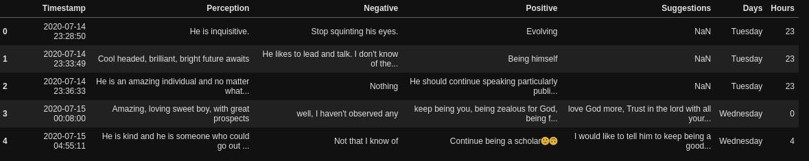
Next thing, we want to get basic descriptions of our dataset, let’s view the first 5 rows
df.head()
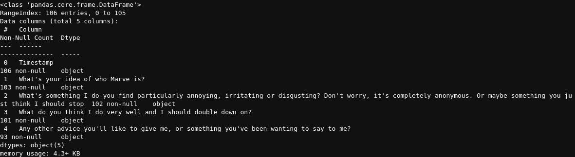
Next, let’s get the shape (rows, columns) in our dataset, the number of rows of each column and their data types
df.shape
(106,5)
df.info()
Then, we also want a brief summary of the counts, unique values, most frequent values and their frequency
df.describe()
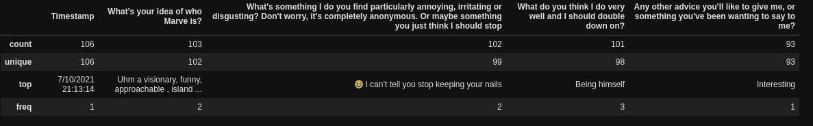
After that, let us get the names of the columns
df.columns

Preprocessing
Now, let’s carry out some basic preprocessing on our data. We want to rename the columns from the very long names they have to much smaller and concise ones. To do that, we will create a dictionary match containing the present column names and the new names we want.
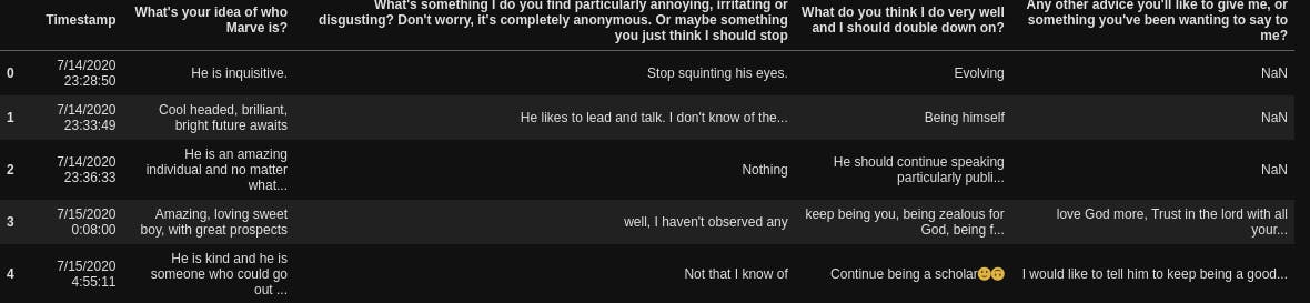
new_columns = dict([("What's your idea of who Marve is?", "Perception"),
                    ("What's something I do you find particularly annoying, irritating or disgusting? Don't worry, it's completely anonymous. Or maybe something you just think I should stop", "Negative"),
                    ("What do you think I do very well and I should double down on?", "Positive"),
                    ("Any other advice you'll like to give me, or something you've been wanting to say to me?", "Suggestions")])
new_columns

Then we will rename the columns
df = df.rename(columns=new_columns)
The next thing we want to do is to create two new columns containing the day (day name, whether Sunday, Monday or so) and hour people filled the form. First, we will convert the “Timestamp” column to a datetime datatype (under the df.info, it showed that it is an object type for all datatypes apart from integers, floats or decimals and booleans i.e True or false, but for us to extract insight from the timestamp column, we need to inform python/pandas that it is actually a date time value and not just strings)
df["Timestamp"] = pd.to_datetime(df["Timestamp"])
Then we will extract the time and day
df["Day"] = df['Timestamp'].dt.day_name()
df["Hour"] = df['Timestamp'].dt.hour
df.head()
After that, we want to bucket the time category, instead of having the hours, we want to convert them to categories such as morning (6:00am- 12:00pm), afternoon(12:00pm - 16:00pm), evening (16:00pm-20:00pm), night (20:00pm-00:00am) and midnight (00:00am - 06:00am)
time_duration = [-1,6,12,16,20, 23]
time_of_day = ["midnight", "morning", "afternoon", "evening", "night"]
df["Hour"] = pd.cut(df["Hour"], time_duration, labels=time_of_day)
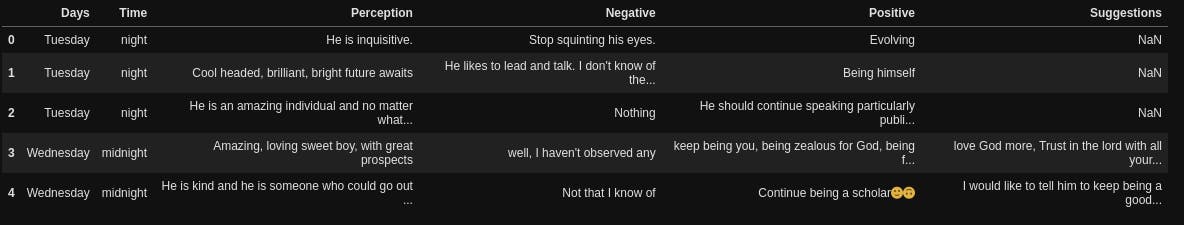
Then we will drop the “Timestamp” column, rename the “Hour” column to “Time” and reindex so that the “Day” and “Time“ columns appear as the first and second columns instead of being the last two
df = df.drop("Timestamp", axis=1)
df.rename(columns={"Hour":"Time"}, inplace=True)
df =df.reindex(columns=["Day", "Time", "Perception", "Negative", "Positive", "Suggestions"])
df.head()
Time analysis
So the first thing we want to know is which day people filled the form the most and what time of the day. To do that, we will create a function that we will be using to create our plots, this will prevent us from writing the same piece of code over and over again.
This function plot_figure creates two types of plot, a barplot and a countplot, for countplot, we pass in a column and it basically counts the frequency and plot the frequency against the name while for barplots, we have to pass in both the Y values and X values. The function is set to create countplots by default and if we want a bar plot, we have to specify it under the plottype “bar”
def plot_figure(xvalues, yvalues=None, plottype=None, xlabel=None, ylabel=None, title=None, file_name="sample.png"):
    fig, ax = plt.subplots(1,1, figsize=(8,7))
    ax.set_title(title)
    ax.set_xlabel(xlabel)
    ax.set_ylabel(ylabel)
    if plottype == "bar":
        sns.barplot(x=xvalues, y=yvalues)
    else:
        sns.countplot(x=xvalues)
    plt.savefig(file_name, dpi=500, bbox_inches="tight")
This function first of all creates a matplotlib figure upon which our chart will be placed, we want just one, figure, so we specified 1,1 for plt.subplots, meaning 1 on the X axis and 1 on the Y axis (altogether meaning 1), then we set the title, the X label and Y label), next we check if the plot type was specified as “bar”, if yes, plot a barplot, if not, plot a count plot. Then we save our image, the dpi (dots per inch) specifies the resolution we want for the image and bbox_inches to fit our chart and their labels in the image properly.
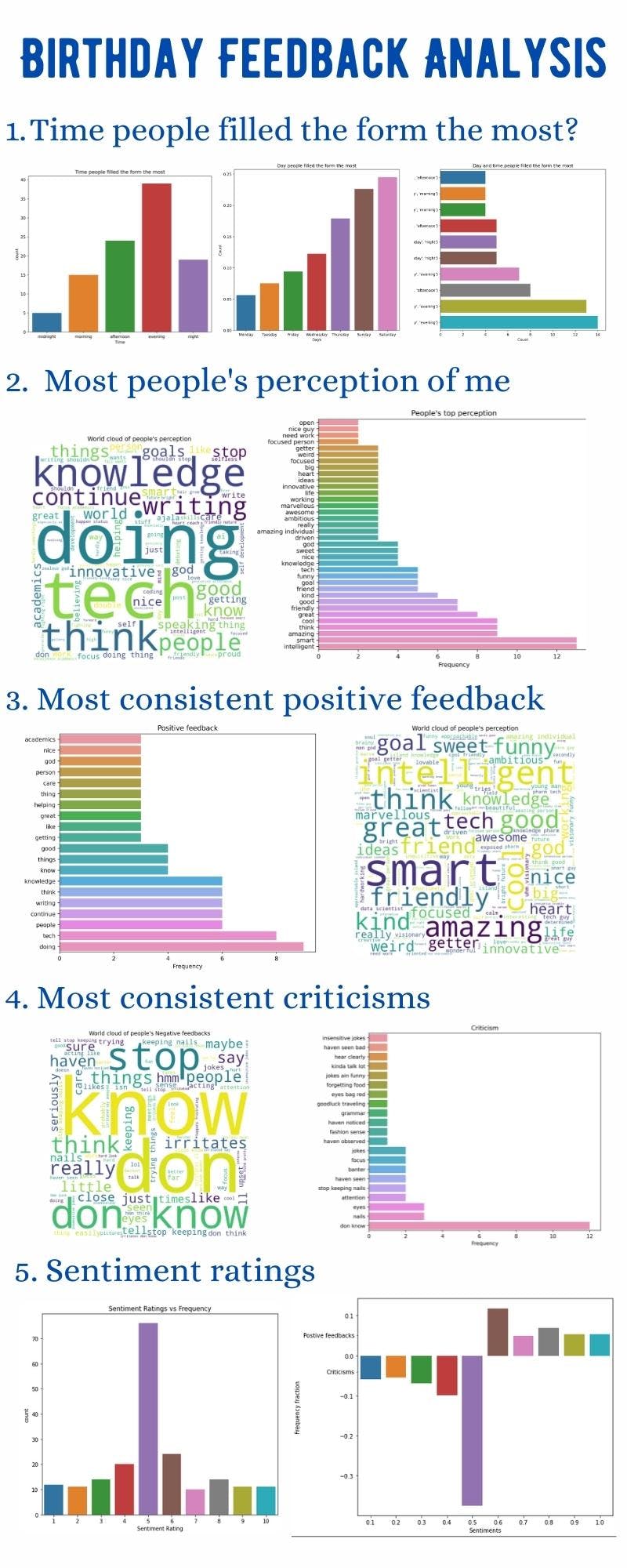
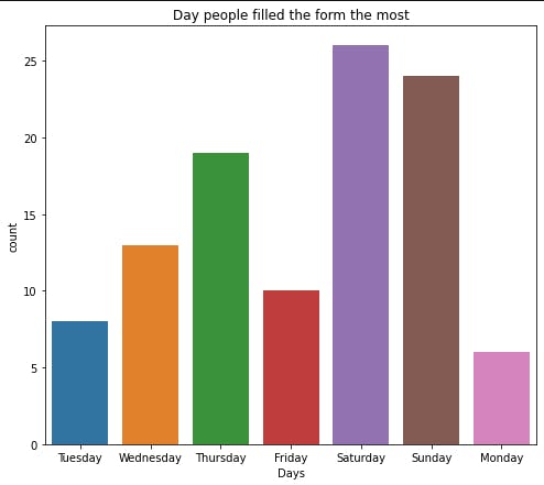
So now, we will create a chart to see the day people filled the form the most.
plot_figure(df["Day"], xlabel="Day", ylabel="Count",
               title="Day people filled the form the most")
Another thing we want is instead of plotting them just like that, we want to see from the day people filled the least to the day people filled the most. So we will get the count of the values in df[“Day”], express each value as a fraction of the total number we have in our data and sort the results
data = df["Day"].value_counts(ascending=True, normalize=True)
data
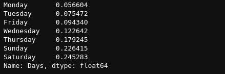
Then we will plot this
plot_figure(data.index, data.values, plottype="bar", xlabel="Days", ylabel="Count",
               title="Day people filled the form the most", file_name="Day.png")
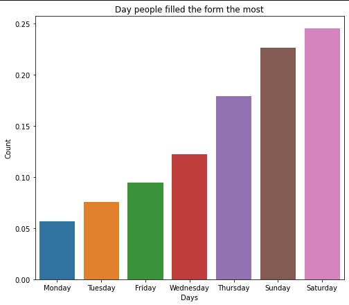
We can get the time people filled the most too
plot_figure(df["Time"], xlabel="Time", ylabel="Count",
               title="Time people filled the form the most", file_name="Time.png")
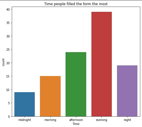
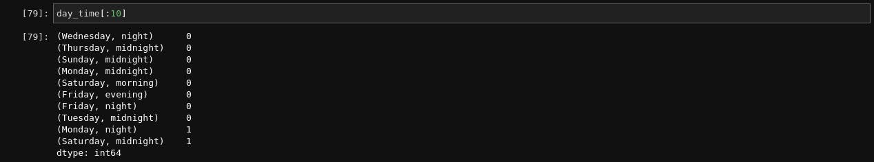
The last thing we want to check under our analysis of the time is the time-day pair, which time of which day did people fill this form the most? To do this, we will group our data by day and time and find the size (the count)
day_time = df.groupby(["Day", "Time"]).size()
day_time[:10]
Next, we will reassign the index to bear both the name and the time, the two values we used to group and sort the values, the new result looks like this
day_time.index = day_time.index.values
day_time = day_time.sort_values()
day_time[:10]
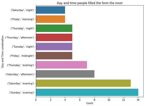
So let’s plot this to see only the top 10 values
plot_figure(day_time.values[-10:], day_time.index[-10:], plottype="bar", xlabel="Count", ylabel="Day and Time combination",
               title="Day and time people filled the form the most", file_name="Day_time.png")
Perception Analysis
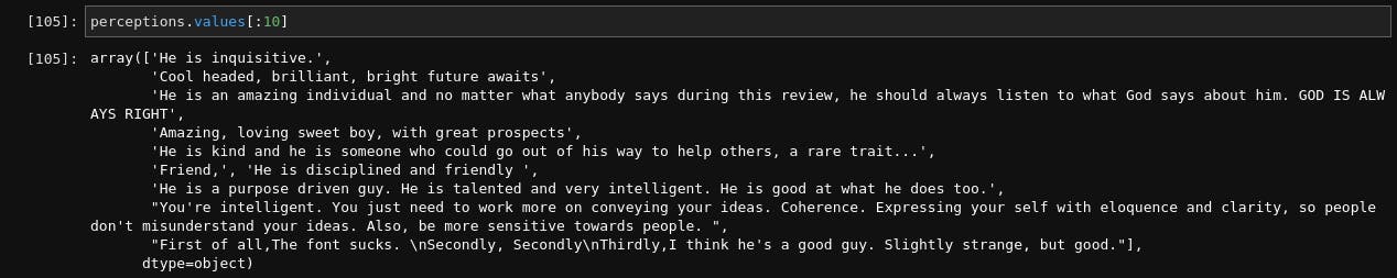
The next thing we want to do is to analyze the perception column, so let’s assign it to a variable named perception, check the size and view the first 10 rows
perceptions = df["Perception"]
print(perceptions.size)
perceptions.values[:10]
106
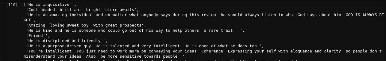
So we will do some basic data cleaning, we want to remove all the punctuation in the data, and replace them with empty space (because some people don’t add space before and after their punctuation, so the words don’t end up being merged together), remove the preceding and trailing empty space for each sentence and convert all to lowercase (python will really interpret “Python”, “python” and “PYTHON” as all distinct values), so we will create functions to do this, to improve reusability of the codes.
import sys
import unicodedata

def create_puncts():
    """Create punctuations from punctuations in Unicode category"""
    punctuation = dict([(i, " ") for i in range(sys.maxunicode) if unicodedata.category(chr(i)).startswith('P')])
    return punctuation


def remove_punctuations(x):
    """Replace every punctuation in the sentence with an empty space"""
    if isinstance(x, str):
        return x.translate(punctuations)

def clean_text(x):
    """clean the text to remove trailing and preceding spaces and convert all to small letters"""
    # remove unnecessary starting and ending space
    x = x.strip()
    # Convert them all to lowercase to avoid duplications
    x = x.lower()
return x
The first function checks for all the system’s Unicode characters and created a dictionary for all characters that belong to the category of punctuation (not exactly the most optimal method out there but it works, hahaha) to be matched with an empty space. Next, we used the python string method, translate, to match and replace the punctuation in each sentence, and lastly, we cleaned each sentence to strip (remove unnecessary space) and covert to lower case. Now let us see our transformation on the dataset.
punctuation =create_puncts()
perceptions = [string.translate(punctuations) for string in perceptions.values if isinstance(string, str)]
perceptions = [clean_text(i) for i in perceptions]
Perceptions[:10]
Our data has basically been cleaned for us. So the next thing we will do is to convert all the functions we used to clean our data to just one function so we don’t have to be calling them one after the other
def parse_text(dataframe, column):
    data = dataframe[column].values
    data = [sentence.translate(punctuations) for sentence in data if isinstance(sentence, str)]
    data = [clean_text(sentence) for sentence in data]
return data
Now that we have done this, we want to convert our data (the selected column) to a dataframe, where each column will be every word present in the entire column, we will also enable n_grams where we don’t want just one word each but also pairs of words that occur together to better understand what they are trying to say. But we will stop here as we necessarily don’t want to see the whole dataframe, we just wanted a way to see the most recurring words in every sentence. To do that, we will find the sum of every column and return only the number of top values we want to see, the words and their values (The more times a word or pair of words appear in the column, the higher the value of the sum will be since each appearance have a value of 1.
Note that the dataframe we will create here will have the length of all the word-pairs in the dataset (or selected column of the original dataset) as its columns and the number of rows will be the same as in the original dataset minus the null values (the point in the previous function where we used dataframe[column].values removed the null values from our data). For each row, if a word or word pair exists in that row, the column bearing the word/word-pair has a value of 1, for other words and word pairs that are in the dataframe list of columns but don't appear in that row, they have a value of zero, thus making it easier for us to identify the words present in each row.
# Import the package we will use
from sklearn.feature_extraction.text import CountVectorizer

def get_tops(data, ntop, n_gram=2):
    vectorizer = CountVectorizer(ngram_range=(1,n_gram), stop_words="english")
    data = vectorizer.fit_transform(data)
    data = data.toarray()
    columns = vectorizer.get_feature_names_out()
    df = pd.DataFrame(data, columns=columns)
    most_freq = df.sum().sort_values(ascending=False)[:ntop]
return most_freq
We used CountVectorizer to create our words dataframe, the ngram_range specifies how long the word pairs we want it to consider (if we set that to 2, then it will consider 2 words to make a pair e.g a sentence that contains “This man is so rich” apart from having each of the words as a column will also contain word pairs like “This man”, “man is”, “so rich” and many others as distinct columns too) and stop words to remove English stop words like ‘is’, ‘I’, ‘his’, ‘to’, ‘of’ etc. Then we used fit transform to convert the list of rows to dataframe and convert it to an array (this is because it is saved as a sparse matrix to save memory)
We use the sparse matrix in analysis for matrices (n,m) arrays that contain so many zeros and very few values
After that, we used get_feature_names_out() to get the names of each column of the array, converted them to a dataframe, calculated the sum of each column (to see the most prevalent words in that data (column of the original dataset), sort the values in the descending order, largest to smallest and return the number of values I want to see. Let’s get the values here.
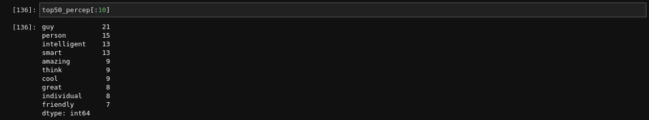
percep_data = parse_text(df, "Perception")
top50_percep = get_tops(percep_data, 50)
top50_percep[:10]
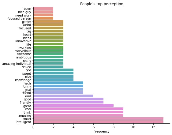
The next thing after this is very experimental, so we have to check the values to see the result. Sometimes, some of the words there may not make sense e.g guy, person, individual, person. While they are perfect English words, they do not carry the information we need, so we will have to check and remove them, sometimes, we may want to increase the number of words used to create our word pairs maybe we will be able to extract more meaning, anyhow you want to do it, you can tinker with it here. To drop any word or words, you can use
def drop_values(data, words):
return data.drop(words)
So I will drop some words I don’t think carry the information we are trying to get.
values_2drop = ["guy", "person", "individual", "loves", "help", "man", "people", "don", "need", "talk", "says", "like", "things", "know"]
top_percept = drop_values(top50_percep, values_2drop)
Next, we will plot a bar chart to visualize these top words
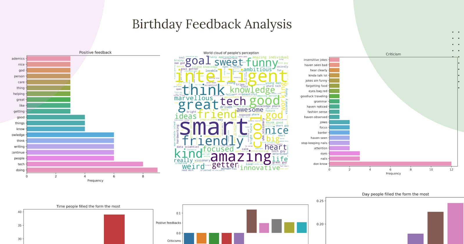
plot_figure(top_percept.values, top_percept.index, plottype="bar", xlabel="Frequency",
            title="People's top perception", file_name="perception_bar.png" )
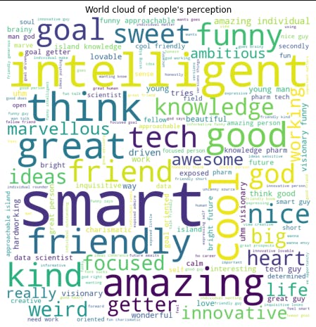
Another thing I wanted to create was a word cloud that will show the most frequent words in the data with their size depicting their frequency. To do that, we will be using word cloud, if you don’t have it already on your PC, you can download it with pip using
pip install wordcloud
And there you go. To create the world cloud, we will import the word cloud package, create a distinct word cloud data that contains 200 words (this is because very few values will make our word cloud look scanty and unappealing), and convert them to a dictionary with the words being the keys and their frequency being the value, then we will create a function to plot, show and save the word cloud
from wordcloud import WordCloud

def wordcloud_data(data, values_2drop=None):
    cloud_data = get_tops(data, 200)
    if values_2drop != None:
        cloud_data = drop_values(cloud_data, values_2drop)
    cloud_data = cloud_data.to_dict()
    return cloud_data

def create_wordcloud(wordcloud, title=None, file_name="sample.png"):
    fig, ax = plt.subplots(1,1, figsize=(8,8))
    ax.set_title(title)
    cloud_plt = cloud.generate_from_frequencies(wordcloud)
    ax.imshow(cloud_plt)
    ax.axis("off")
    plt.savefig(file_name, dpi=500)
We will now create a word cloud for our ‘Perception’ column of the original dataset.
word_percept = wordcloud_data(percep_data)
create_wordcloud(word_percept, title= "World cloud of people's perception", file_name="Wordcloud_percept.png")
Criticisms
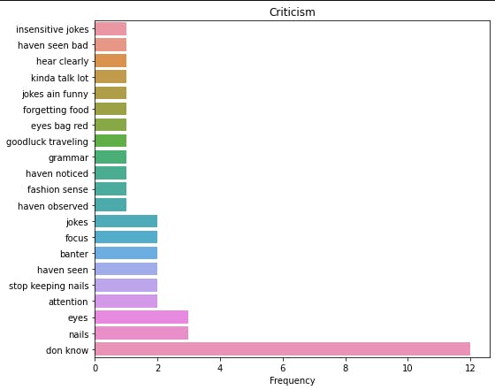
Since we have created all of the functions we will be using, we will just be calling this function. Let’s get our criticism data and parse it
critic_data = parse_text(df, "Negative")
top_critic = get_tops(critic_data, 50)
I had to tinker with this a lot also, tried n_gram=3 to see if I could extract more meaning, increased the “ntops” to view more values, I had to select just a few values that meaningfully contribute to the information I was trying to get.
critics = ["insensitive jokes", "don know", "stop keeping nails", "haven seen", "banter", "nails", "eyes",
          "focus", "jokes", "attention", "fashion sense", "grammar", "goodluck traveling", "eyes bag red",
          "forgetting food", "jokes ain funny", "kinda talk lot", "hear clearly", "haven seen bad",
          "haven noticed", "haven observed"]
critics = top_critic[critics].sort_values()
Then we will plot (barplot) the top values
plot_figure(critics.values, critics.index, plottype="bar", xlabel="Frequency",
            title="Criticism", file_name="negative_bar.png" )
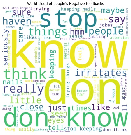
Then we created the word cloud.
critic_wordcloud = wordcloud_data(critic_data)
create_wordcloud(critic_wordcloud, title= "World cloud of people's Negative feedbacks", file_name="Wordcloud_critic.png")
Positive
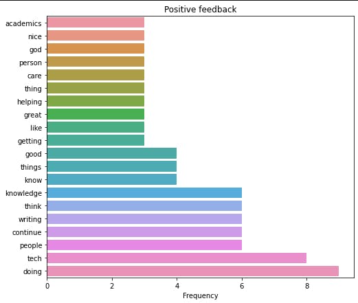
We will just recreate the same thing we did for criticisms for the positive feedback. Let’s get and parse our data and also get the top positive feedback.
pos_data = parse_text(df, "Positive")
top_pos = get_tops(pos_data, 50)
Next, we will plot the top 20 comments
plot_figure(top_pos.values[:20], top_pos[:20].index, plottype="bar", xlabel="Frequency",
            title="Positive feedback", file_name="positive_bar.png" )
And the word cloud also
word_pos = wordcloud_data(pos_data)
create_wordcloud(word_pos, title= "World cloud of people's perception", file_name="Wordcloud_pos.png")

Sentiment rating
The last thing I want to do is to rate the sentiments on how positive (the positive feedback) or how negative (the criticisms) were. To do this, we will combine the positive feedback and criticism together while labelling the positive feedback as one and the negative feedback as zero (for our model to differentiate both), based on these values, we will train our machine learning model to give an estimated rating over 1 to each feedback. To do this:
pos = parse_text(df, "Positive")
neg = parse_text(df, "Negative")
print(f"Length of positive comments: {len(pos)}")
print(f"Length of negative comments: {len(neg)}")
Length of positive comments: 101
Length of positive comments: 102
To extract and parse the positive feedback and criticism. Then we will combine both of them, with the first 101 rows being ‘pos’ and the next 102 rows being ‘neg’
combined = pos + neg
len(combined)
(203, )
Next, we will convert combined to a dataframe as we have always done.
def make_df(data):
    vectorizer = CountVectorizer(ngram_range=(1,3), stop_words="english")
    data = vectorizer.fit_transform(data)
    data = data.toarray()
    columns = vectorizer.get_feature_names_out()
    df = pd.DataFrame(data, columns=columns)
return df

comb_df = make_df(combined)
comb_df.shape
(203,1279)
Next, we will create the target values, and we will assign pos as 1 and neg as 0, remember, when we combined pos and neg to get our dataframe, the first 101 are pos and the remaining are neg. So we will use the same thing to create the target values too
# Create target values,  first 101 = pos and last 102 = "neg"
target = np.concatenate([np.ones(101), np.zeros(102)])

target.shape
(203, )
Next, we will split our data into training and test set while also shuffling it, we don’t want the training set to contain only pos or neg, we want both the training and test to combine both (train_test_split will also shuffle the data for us)
from sklearn.model_selection import train_test_split
X_train, X_test, Y_train, Y_test = train_test_split(comb_df.values, target, test_size = 0.3, random_state = 2022)
X_train, X_val, Y_train, Y_val = train_test_split(X_train, Y_train, test_size = 0.3, random_state = 2022)

len(X_train), len(X_val), len(X_test), len(Y_train), len(Y_val), len(Y_test
(99, 43, 61, 99, 43, 61)
We split our data twice so as to have a test set and a validation set. For every model that we will try, we will evaluate them with the validation data and we will only use the test set to test the final selected model. This will make sure that we don't also overfit our data to the test set and that we have some data has never seen before to make a proper assessment of how our model performs in the presence of unseen data
We are going to scale the data next, try some models (Logistic Regression and Support Vector Machine) and find the best hyperparameters using GridSearch
from sklearn.model_selection import GridSearchCV
from sklearn.pipeline import Pipeline
from sklearn.preprocessing import StandardScaler
from sklearn.svm import SVC
from sklearn.linear_model import LogisticRegression
Let us scale the data
X_train_scaled = StandardScaler().fit_transform(X_train)
X_val_scaled = StandardScaler().fit_transform(X_val)
Let us train our logistic regression model using GridSearchCV.
GridSearchCV combines Gridsearch to find the best hyperparameter i.e try all the hyperparameters we pass to find the one that will result in the best accuracy score and also perform cross-validation i.e splits our data into n folds, and combine different folds to train and different folds to test to avoid overfitting
We will define the different parameters (C ) we want to use to train our logistic regression model, we will instantiate GridSearchCV and train the model
param = dict([("C", [0.001, 0.01, 0.1, 1, 10, 100])])
gridlogit = GridSearchCV(LogisticRegression(), param, cv=5)
gridlogit.fit(X_train_scaled, Y_train)
We want to see how well our model did on both the training set and the validation set
print(f" Best training accuracy: {gridlogit.score(X_train_scaled, Y_train)}")
print(f" Test accuracy: {gridlogit.score(X_val_scaled, Y_val)}")
Best training accuracy: 0.9595959595959596
Test accuracy: 0.6511627906976745
Our model has very obviously overfitted our data, we can see the drop-off from the training to the test dataset. Let us try a stronger model, let us try support vector machine.
param = dict([
    ("C", [0.001, 0.01, 0.1, 1, 10, 100]),
    ("gamma", [0.001, 0.01, 0.1, 1, 10, 100]),
              ])
gridcv = GridSearchCV(SVC(kernel="rbf"), param, cv=5)
print(f" Best training accuracy: {gridcv.fit(X_train_scaled, Y_train)}")
print(f" Test accuracy: {gridcv.score(X_test_scaled, Y_test)}")
Best training accuracy: 0.971830985915493
Test accuracy: 0.5581395348837209
So it seems our Logistic Regression Model is the better one, after all, even though it is not really a great model, we will be using it like that. GridSearch automatically fits the best model to gridsearch, so we will be using it to evaluate our test data to get the actual performance of our model on unseen data
X_test_scaled = StandardScaler().fit_transform(X_test)
gridlogit.score(X_test_scaled, Y_test)
0.6557377049180327
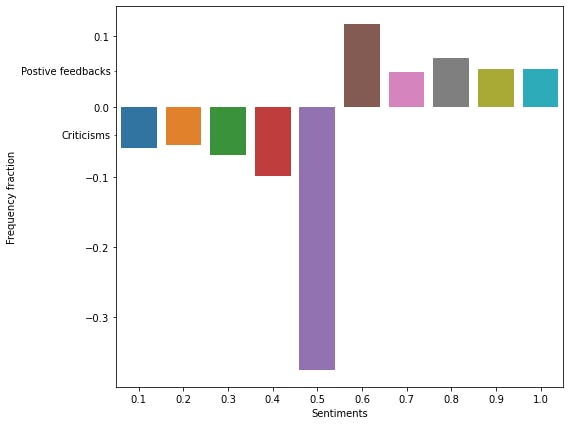
The final thing we will be doing is to use our model to get the sentiment rating of our entire data, thus we will be getting the prediction probabilities of the entire data. To do this, we will get the original entire dataset, transform it and get the probability predictions (and not the predictions).
We will be using the prediction probabilities because the predictions themselves will be 0 and 1 for criticisms and predictions respectively but instead we want the probability prediction from 0 to 1. The idea is as we move from very harsh criticisms to very positive feedback, the confidence of our model should go from 0 to 1, 0.1 being very harsh criticism (and very far from the positive feedback and vice versa) with mild compliments/criticisms ranging from 0.4 to 0.6 (meaning the positive feedback look like criticisms and the criticisms look like positive and thus the model can’t easily separate them out).
To do this, let’s get the original combined dataset, transform it and get our probability predictions
X = StandardScaler().fit_transform(comb_df.values)
rating = gridlogit.predict_proba(X)[:, 1]
This has generated predictions (over for each comment) whether it is a positive compliment or criticism and estimated the rating, but the values produced are floats (decimals) implying that they will all be unique. So we will bucket them such that all values from 0.0 – 0.1 will be in a group, and 0.1-0.2 will be in another group till we get to 1.
new_Y = np.digitize(rating, bins=[0.1,0.20,0.30,0.40,0.50,0.60,0.70,0.80,0.90,1], right = True)
new_Y += 1
values, counts  = np.unique(new_Y, return_counts=True)
values = values/10
counts = counts/np.sum(counts)
we add 1 to the values because numpy automatically assigns value 0 to the first group, and 1 to the second group, but we want to have values 1-10 representing the groups instead of 0-9, next, we then used np.unique method to get the values and their frequency of each of the values (using the return_counts parameter). Because our original prediction was over 1 (remember 1 represents the truest and best positive feedback we can get while 0 represents the worst criticisms), we divided by 10, to get this back. Then we converted the counts to be a fraction of the total number of values we have. The final thing we want to do is to distinguish between positive feedback and criticism, so we want the plots for the positive feedback to face up on the Y-axis and that of criticism to face the other direction, so we would convert the values of criticisms (frequencies of 0.1- 0.5) to negative values, so seaborn can effect the change. To do that
counts[:int(len(counts)/2)] *= -1
The last thing we will be doing is plotting this value now, we will add a little modification to the plot to add a pointer to the part of the graph that correlates with the positive feedback and criticisms.
fig, ax = plt.subplots(1, 1, figsize=(8,7))
sns.barplot(x=values,y=counts)
ax.yaxis.set_minor_locator(ticker.FixedLocator((-0.04, 0.05)))
ax.yaxis.set_minor_formatter(ticker.FixedFormatter(('Criticisms', "Positive feedbacks")))
plt.setp(ax.yaxis.get_minorticklabels(), size=10, va="center")
ax.set_ylabel("Frequency fraction")
ax.set_xlabel("Sentiments")
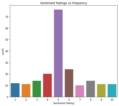
if we want the raw unfiltered plot, we can get that with
plot_figure(new_Y, xlabel="Sentiment Rating", ylabel = "Frequency",
            title="Sentiment Ratings vs Frequency", file_name="Sentiment_rating.png" )
And that is the end of our project. If you enjoyed it or found it useful, please drop a reaction, comment and most importantly, share with someone else you think it might help, till the next one, selah.